Case study [Kaspersky In-Product Purchase]
The client and account manager requested that I led on a project to redesign the client's in-product renewal flow. I estimated the project hours, breaking it down into phases and milestones. Overall; this required an analysis of how the renewal flow fitted into the overall user journey before identifying how it could be streamlined and improved. I then rapidly iterated low-fidelity prototypes in Adobe XD, ensuring the user experience felt natural. Reviewing with the account manager, we ensured all the legal necessities were present.
With the XD prototype to view interactions and style, along with the support documentation… it put the developers in a good place to complete the implementation of the redesign. This was then rolled out as an A-B test, focussing on Site Optimization, and collating enough data to have a high confidence level before full scaling.
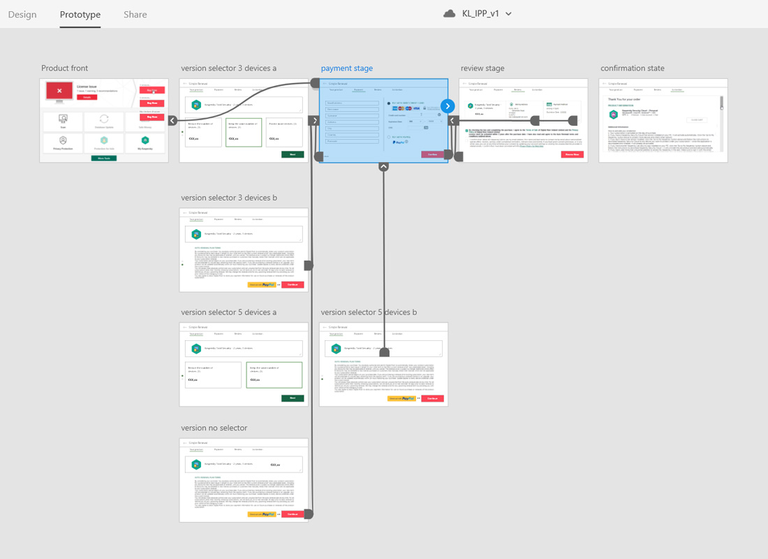
Rapid prototyping in XD. Simple flow mapped out, with forward and back navigation where appropriate.
Screen capture illustrating prototype interactions. The legal requirements were the auto-renewal notice, seller of record T&Cs and marketing opt-in check boxes. In the old flow, these were on different screens, resulting in a disjointed feel. There was also no way to adjust the number of device the subscription covered so users looking to upgrade or downgrade were dropping off.
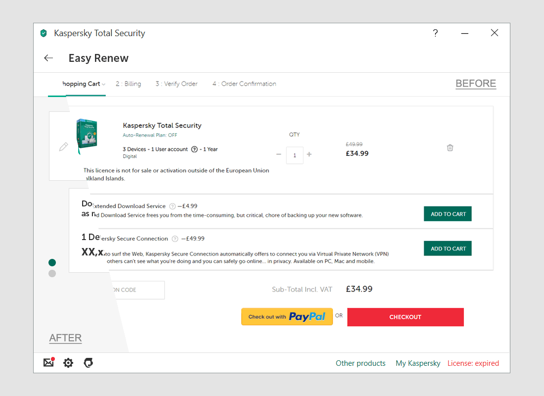
Design with updated styles. Before and after. The intention here was to make the flow look more like an in-product renewal and less like a new cart purchase. This reduced user friction.
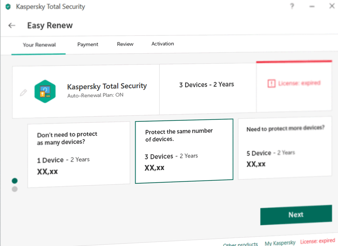
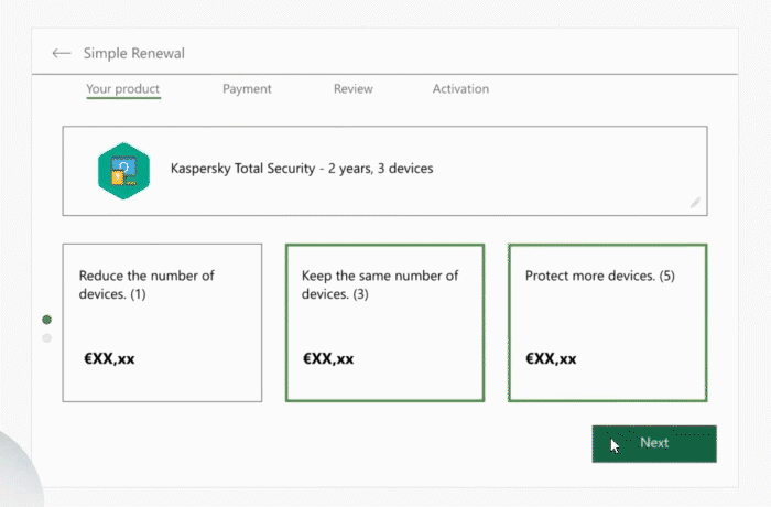
Animation showing 3 stages of the flow with the new design. I removed any unnecessary distractions, like line items and unnecessary input fields. By placing the marketing opt in on the review page, it freed up space to merge the payment and billing stages - effectively removing a stage in the process and streamlining.
Case study [LenovoPro]
Lenovo are a well known computer manufacturer. They wanted to focus on an initiative called LenovoPro; to reward customer accounts that ordered regularly, most likely on behalf of small businesses. This was to sit between individual consumers and B2B bulk orders. This required marketing materials such as display banners, a dedicated landing page and an updated cart experience.
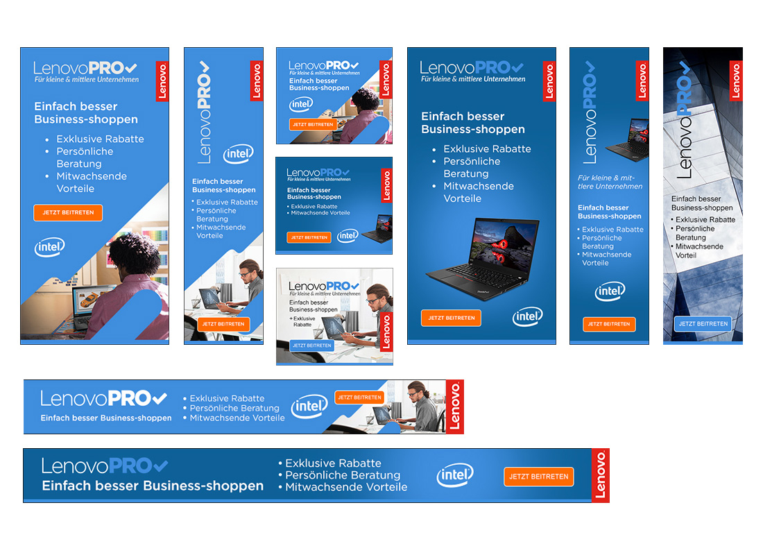
Banners - Full banner sets with different messaging, languages and sizes were required. Because this 'Pro' arm was fairly new, I also needed to define a brand accentuation for it; the imagery, an emphasis on the colour blue, and increased use of the Pro logo.
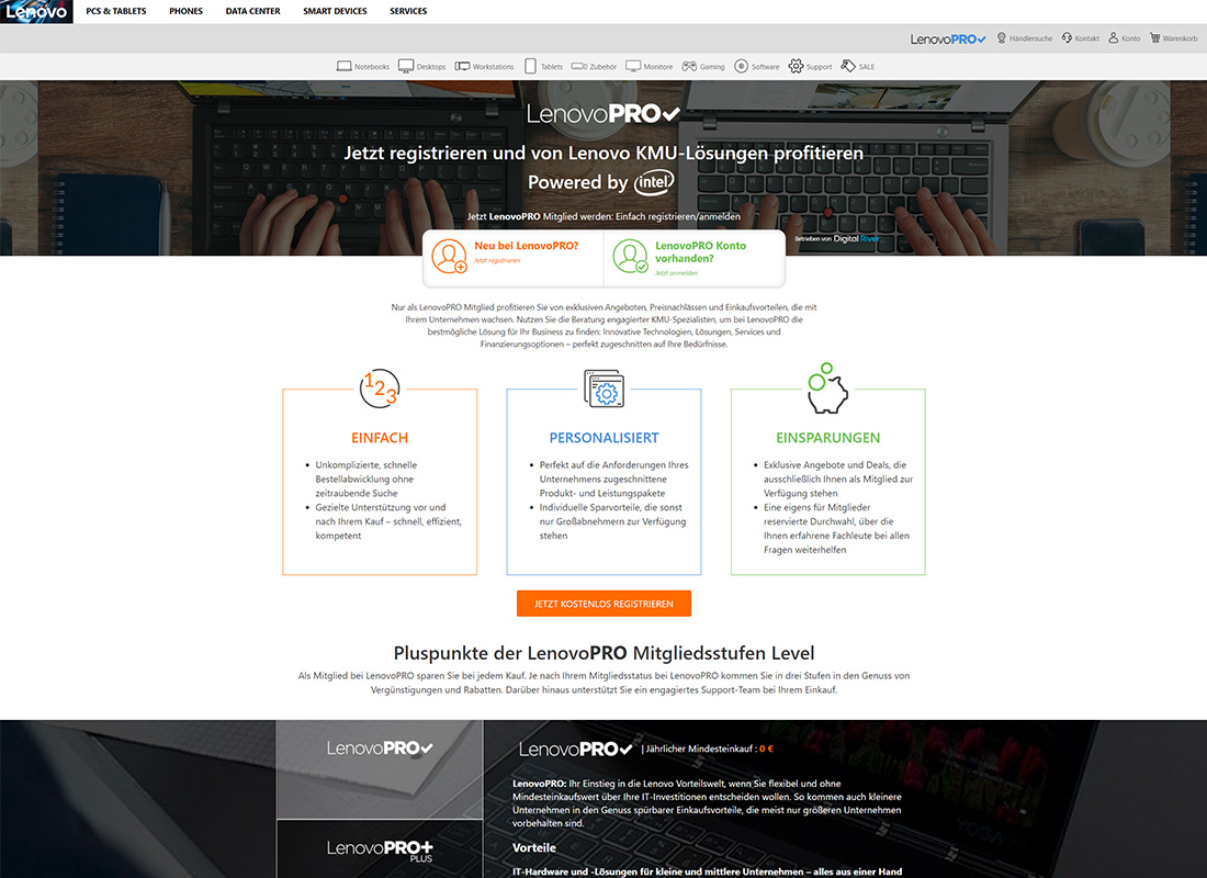
Landing page - I built out the fully responsive page, incorporating the accordion content and styled hover states. Built with Bootstrap 4. This was designed by another designer using a set of brand definitions I had put together earlier.
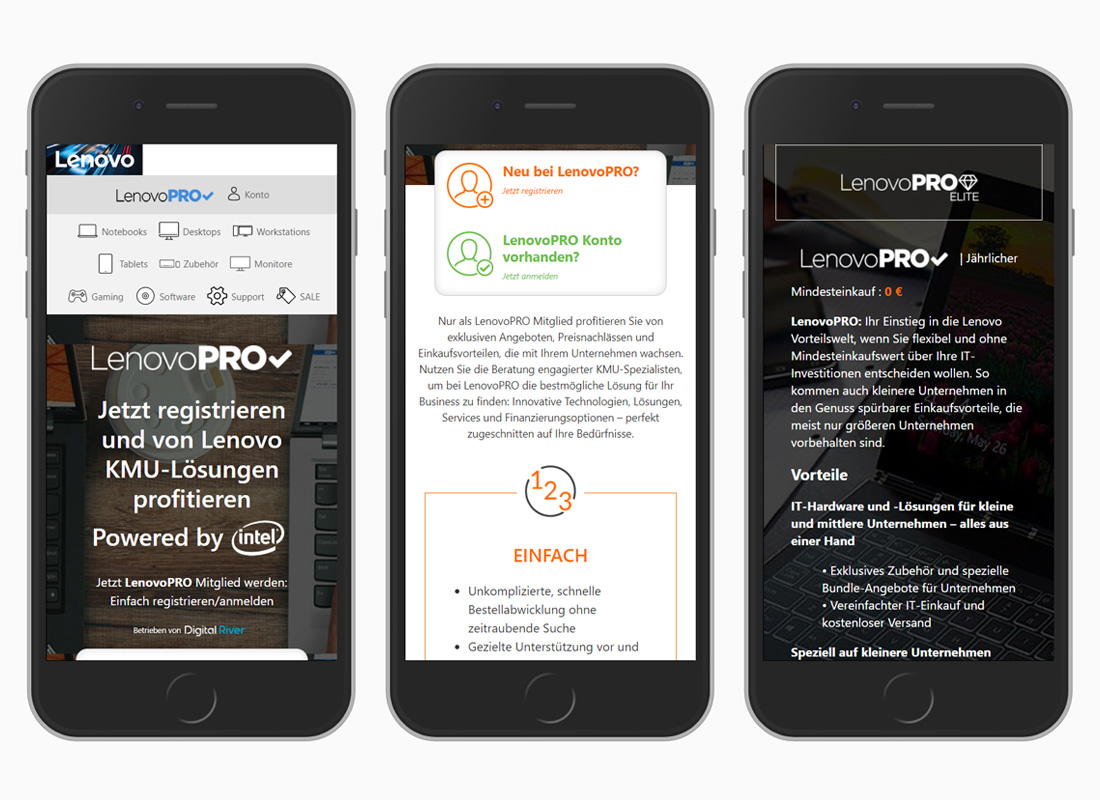
Landing page as shown on mobile. This was hosted on the GC platform. The page introduced the user to the idea of the tiered spend brackets. The more you spend with LenovoPro, the higher bracket you go into, and the bigger discount you get on future orders. As well as other perks.
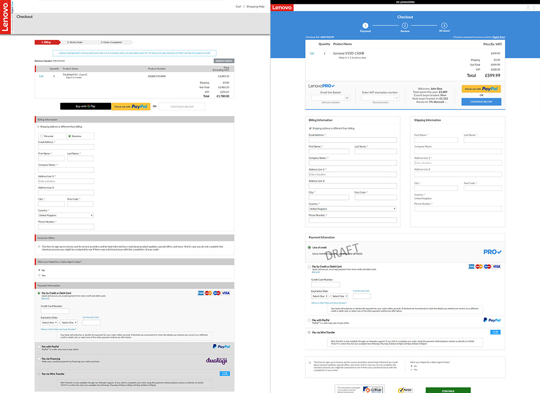
To assure the user that they are checking out in the LenovoPro environment, the cart needed a few tweaks and a re-skin. The existing cart (left) had some room for improvement, so I tightened up the visuals and added the LenovoPro line-of-credit payment method. Once the customer was logged in, it allowed me to pull in their previous order information, which spend bracket they were in and how much more they needed to spend to reach the next 'level'.
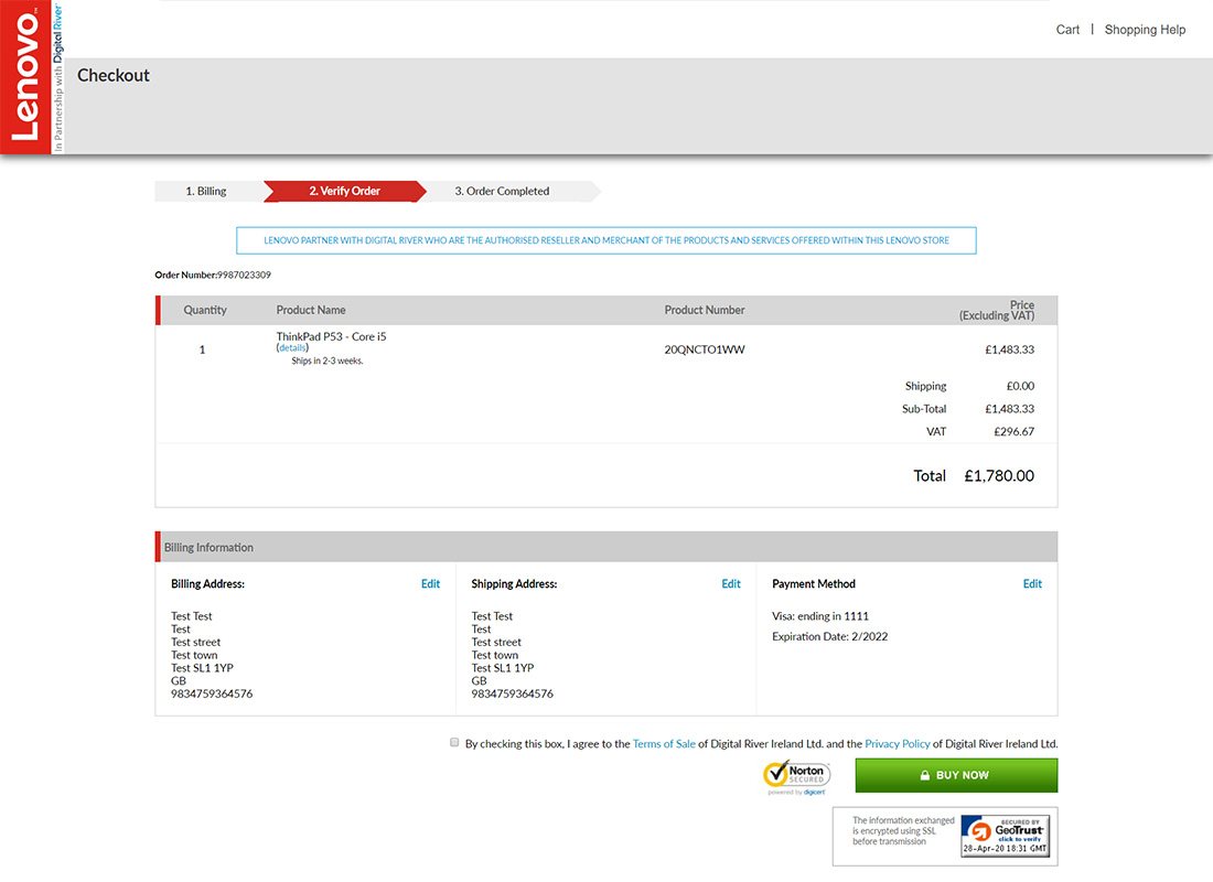
The standard cart review page.
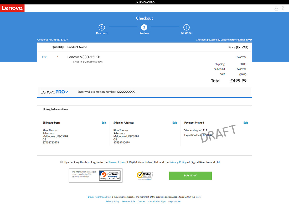
The LenovoPro cart review page. Using more blue, and integrating the Pro logo.
Case study [Nuance Cart]
Nuance provide voice recognition/dictation products for businesses and consumers. Their B2C checkout flow was looking a bit dated, and I was tasked with giving it a visual overhaul, without making costly fundamental changes.
KPIs: Increased conversion, increased revenue.
Results: +3.7% Conversion Rate | +4.7% Revenue Per Visitor | (Email traffic, +23% Conversion Rate)

This is the cart overview before my facelift. The client wasn't a fan of the purple as it was no longer representative of the brand. The main direction was to make it cleaner, sleeker and lighter.

This is the cart overview after the facelift. I took the approach of removing boxes and subdivisions where applicable. I increased the information hierarchy. And I pulled in the updated border colours, font family and weighting.

Increased emphasis on the breadcrumbs. As well as making everything lighter.

Gradiented border colour adds a bit of visual flair and ties in newer brand colours without being overpowering. The final set of designs was handed to the Web Dev team to implement the styling changes.
Case study [Kaspersky Affiliate]
Kaspersky sell anti-virus and internet security software. One of their consumer channels is through affiliates. The program manager approached me about reworking their affiliate landing page, to offer a better experience.
KPIs: Increase conversion rate.
Results: +100% Conversion Rate, up from 2.5% to 5% and stable.

This redesign was a chance for a fresh start. Affiliate traffic has likely already done the product research and are looking for a clear and simple transition to check out. Reduced clutter and clear product variation selection allows this.

The filter options towards the top of the page allow for the quick segregation of product, depending on the customer's need. This feature also allows the page to load with specific filters activated, so affiliates can offer more targeted links.

To ensure customers didn't need to leave the page to seek more information, I added the product features details to an overlay.

Fully responsive build for tablet and mobile. Columns stack for filter, products and buy blocks. Includes bottom of page 'return to top' button.
Case study [Flir Affiliate]
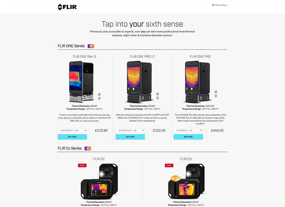
Flir offer, amongst other things, a range of thermal imaging cameras, from £150 to £30,000+. They needed a landing page for their affiliate channel - This was intended to cut out the noise of their myriad other offerings and bring the more affordable consumer products into one place. This page contributed to the fantastic performance of the channel and harbored a couple of neat technological solutions/features.
This page was powered by dynamic product information pulled in via ajax call. Upon fetching the JSON data, I processed it and displayed the vat inclusive price and the stock levels. I then wrote a function to calculate the excluding vat price, at client request.
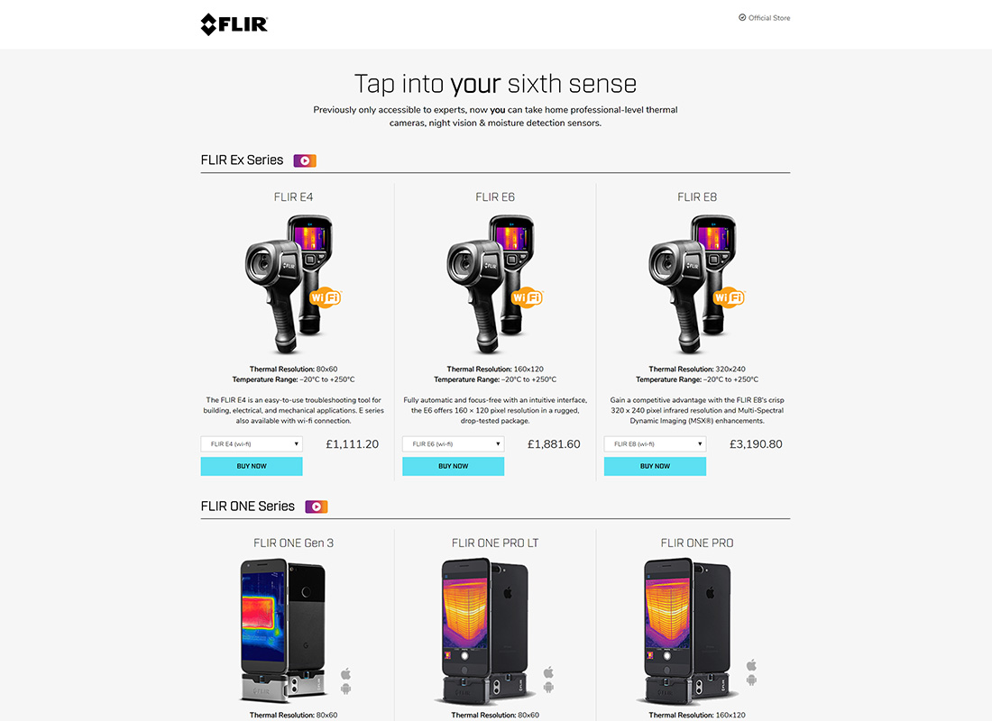
This page built upon my load-pre-filtered function. For example, adding #eseries to the end of the URL brought that content to the top of the page, allowing the program manager to better tailor their ads.
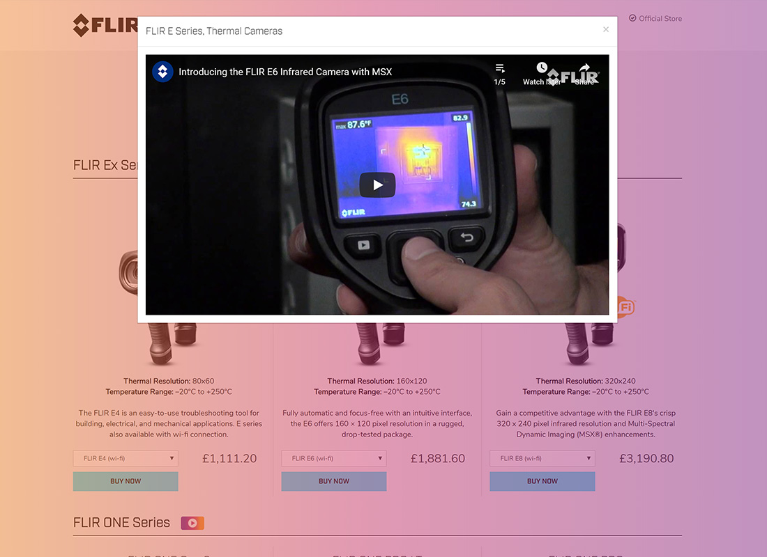
The video overlay background adds a bit of extra colour, utilising in the orange and pink of the thermal displays.
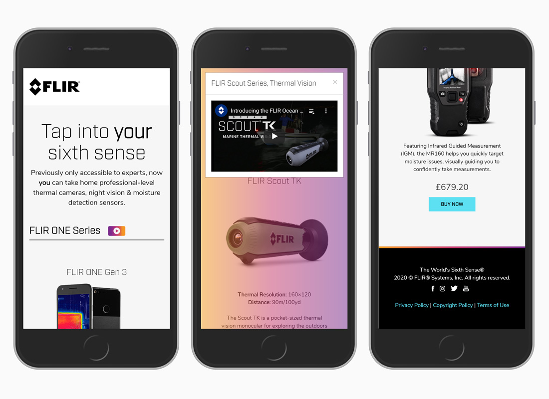
Fully responsive build. On small screens, products stacks and elements resize accordingly.